In a world where user-centered design shapes everything from the apps on our phones to the chairs we sit in, it's almost unfathomable that electronic health records (EHRs) were designed in a way that was everything but user-centered. Doctors spend hours each week on documentation, which can take valuable time away from providing patient care. When something should take two clicks of the mouse, it often takes ten. They are forced to wade through hundreds of documents per patient, many unimportant, for review and sign-off. Doctors struggle under the weight of these systems, which are often cited as the number one reason for physician burnout.
We are changing this at Flatiron. Our mission as a design team is to put our doctors back at the center of electronic health record systems. We want the EHR to live up to the promise of user-centered technology, and we believe that user-centered design can be one of our differentiators. At the core of this mission is a strategy to give doctors a voice through a methodology that has become an industry in and of itself: user research (UR).
User research is a methodology based on one-on-one interviewing and user shadowing. During these focused conversations, we seek to understand not just the functionality of the product as it stands today, but more so the user's fundamental, long-term needs. These insights are at the core of our product roadmapping exercises and product development strategies. The insights serve as our north star and help ensure we are solving the most meaningful problems while also improving the functionality of the tools we create.
Here are some specific examples of how we use UR to improve the EHR.
We observe to help us see what doctors may not
Observation is a crucial part of our process. If you ask a doctor what's wrong with a task that they complete multiple times a day, they can't always tell you. Oftentimes, they just say that it works. But if you watch what they do and how they do it, a user researcher might observe ample opportunity to improve the functionality of a workflow. Doctors conduct specific tasks 100 times a day, and so these patterns become ingrained in their muscle memory. They become so familiar with a task they are unable to see what's wrong with how they do it. Our job is to not only listen to what they say, but to also observe what they do. This enables us to find workflow efficiencies that our users may not even know are possible.
Recently, we set out to improve one element of our EHR: the New Orders workflow, a series of steps a user goes through to schedule tasks including doctor's visits, CT scans and drug regimens. When we asked users what could be improved with the tools, users generally told us that everything already worked well.
Before we went through our entire design process (including user research, product design, and product development), this is what our New Orders feature looked like:
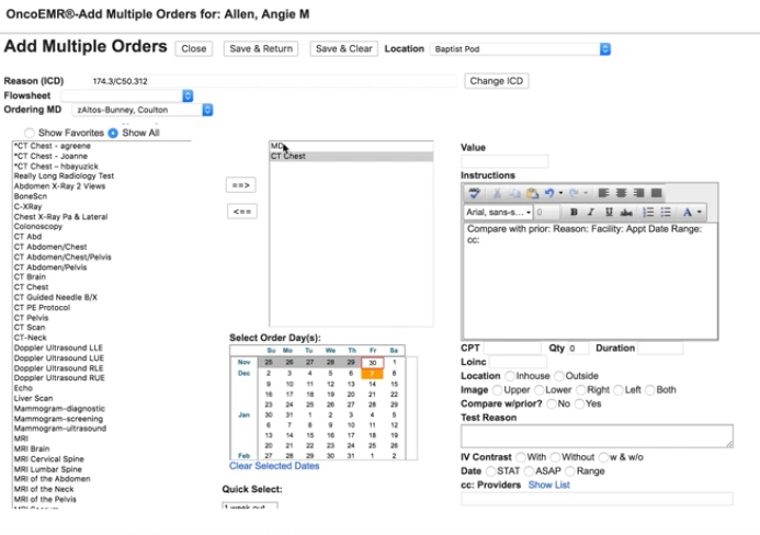 A screenshot of the old New Orders workflow in OncoEMR
When we observed what they did, we saw ample opportunity to improve. Doctors were trying to schedule patient appointments efficiently, ordering CT scans and tests before visits in order to have results and treatment plans ready to discuss with patients during office visits. Instead, what was actually happening was that both activities were being scheduled on the same day, not allowing enough time for doctors to analyze test results. The system did not function the way they thought it did.
One of the many changes we made in this workflow was to make a clear visual distinction between the date of the CT scan and the date of the follow-up visit so that doctors could easily see when specific orders were scheduled. By listening to the doctors' perception of the workflow, and then actually watching them perform the specific task, we were able to design a better workflow so that they wouldn't inadvertently make mistakes.
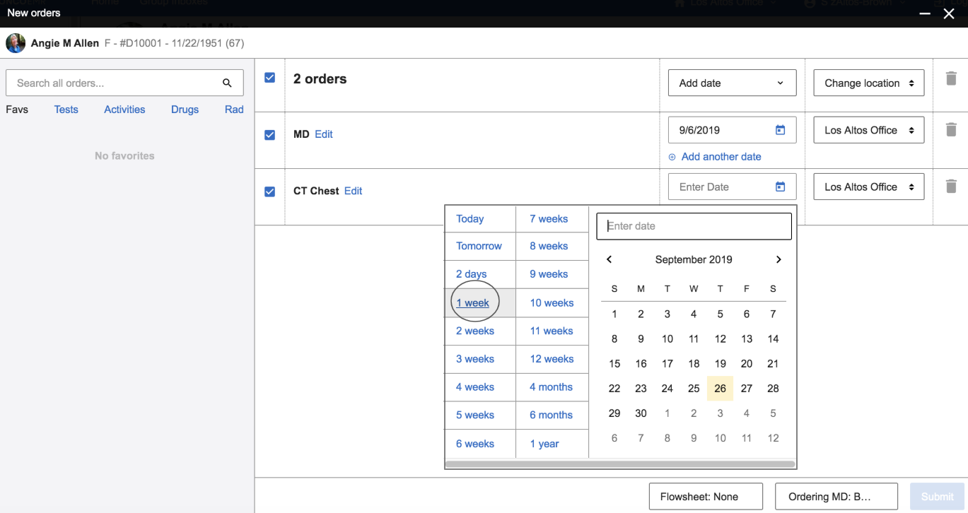 A screenshot of the redesigned New Orders workflow in OncoEMR
Identify problems where we can make leaps in functionality, in addition to incremental improvements
When a patient comes into a doctor's office with symptoms, a doctor can treat the symptoms or get to the bottom of why the symptoms are there in the first place. For a cut, sometimes a Band-Aid works. For more complex issues, it may take some digging to get to "why." Designing and improving an EHR is no different. Like doctors, we like to understand symptoms, but then we dig deeper to understand root causes.
One project we're currently working on is the improvement of a key workflow in our EHR: documenting a patient visit. For every 15-minute patient visit, a doctor can spend up to double that amount of time documenting the appointment. Originally, we set out to improve the visit note. There are lots of opportunities to improve this workflow, including streamlining fields, reducing clicks or combining tabs. But optimizing what we currently have will not provide the necessary gains in productivity our doctors need. User research is our process to listen to what doctors have to say, understand the symptoms, and then dig deeper to understand the core.
What we learned through user research challenged how we approached the problem. We had assumed most documentation occurred simply by completing the visit note workflow. Instead, we saw that documenting a patient visit actually takes no fewer than six different workflows spread across six different pages in the EHR. This includes completing a rooming note, reviewing the patient's history, reviewing testing results and new documents from other specialists, summarizing the visit, adding new orders, writing an assessment and plan, and finally pushing a visit charge. To complete documentation in the EHR, a doctor needed to crisscross our software to find, input and submit information. For doctors who see upwards of 25–30 patients a day, this is a heavy burden.
User research helped us reframe how we went about improving the visit note by streamlining workflow from six pages to one, allowing standardization of practices, reducing time lost to page navigation, and ensuring all documentation is complete across every patient. Deep context provided by user research helped our teams focus on solutions that would result in meaningful shifts in productivity.
Calculate the trade-off between where to remove or add clicks
When we talk to users, reducing clicks is a consistent point of feedback. Clicks matter for every one of our users — our doctors, billers, nurses, administrators, research coordinators — everyone. For each patient visit, doctors must document the visit, add new orders, add charges, sign relevant clinical documents, and more. Each of these tasks is a different, complex workflow with multiple steps and a lot of clicking. While a couple of extra clicks added to one of these workflows doesn't seem like much, when you add these extra steps up across patients per day, you can be adding hours of extra clerical work per week. When we set out to redesign a workflow, UR is our tool to navigate the trade-off between removing or adding clicks.
One example is when we set out to redesign Regimen Selection. A regimen is a bundle of drugs that are given to a patient at any given time. There are thousands of regimens all with specific use cases and nuances. When a doctor needed to add a regimen, the system would pre-populate options that corresponded with the patient's primary diagnosis. The list included thousands of results, making scrolling and navigation burdensome.
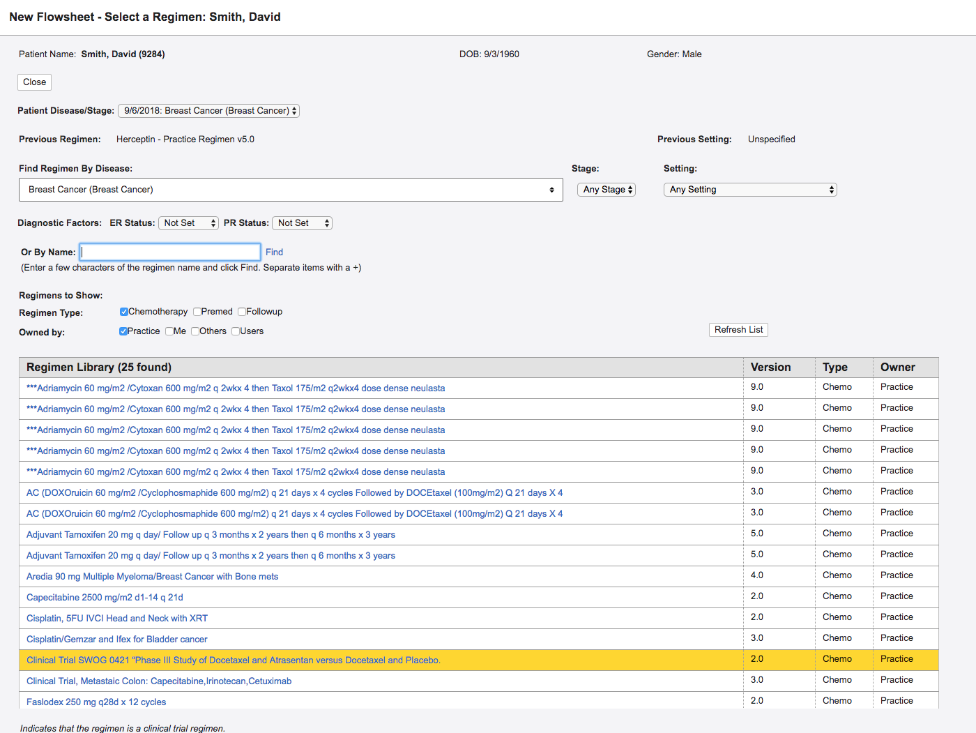 A screenshot of the old Regimen Selection page in OncoEMR
In this redesign, we did something doctors hate: we added an extra step. In the old design, doctors saw everything on one screen and a diagnosis was automatically populated from elsewhere in the chart. This sounds great, but when patients had more than one diagnosis, which they often do, providers would have to remember to then choose the correct diagnosis from a select menu. In addition to adding extra cognitive load, this step didn't save them time anywhere else. Doctors would still need to select a diagnosis to search. To order treatment they would then choose the correct billing codes associated with the diagnosis. By adding an extra step, we enabled doctors to confirm the correct diagnosis, filter the list of regimens, and associate the correct billing code, all in one click.
 The newly redesigned Regimen Selection workflow in OncoEMR
When we initially tested this in practices, doctors were at first hesitant about the addition of extra steps. But knowing what problem we were solving and understanding the trade-offs, our teams felt confident with the changes to this flow. The tool actually saved our customers time, as they were spending less time scrolling. Being smart researchers helps us understand the feedback, take it as one data point and then choose an efficient path forward.
Conclusion
User research is a complex methodology that requires us to understand our users and put them back at the center of product development so that we can navigate the design of important product changes.
There is a real cost to change when it comes to the electronic health record, so we have to make design decisions smartly. Unlike consumer technology, our doctors rely on their muscle memory to speed up the time they spend in the software. When we make changes, we slow doctors down, and every second we add to a workflow is time away from other priorities. There is a cost to relearn, retrain and get to know a new system. This means when we roll something out, we need to be sure we have the right solution and the change justifies the cost.
When we put the user back at the center of the EHR, we end up with a better product. User research helps us leverage the expertise of doctors and our strengths as product designers to create foundational shifts in the EHR, not just incremental improvements. Our hope is to create radical shifts in productivity for our doctors so that they can spend less time on the computer, and more time with their patients.