Flatiron today isn’t the same company as the one founded nearly eleven years ago. We’ve evolved. Over the course of the past decade plus, we’ve built upon the foundation of those early days and now have a legacy in technology and data science that’s propelling our forays into clinical research, clinical decision support, end-to-end evidence solutions, and global expansion.
These new endeavors mean that we’re even more poised to make accelerated progress toward our mission: improving and extending lives by learning from the experience of every person with cancer. Given our evolution over the past few years, it became increasingly clear that we needed to reimagine aspects of our company ethos to ensure that the way we showed up in the world reflected the Flatiron we were becoming in the present and future. First, we got to work on better articulating our products, offerings, mission, and vision last year. Next up? Our visual brand identity.
The process of updating our brand identity started with its most recognizable aspect—our logo. Our logo is two diamonds with a precise point of connection—a metaphor for the concept that the whole is greater than the sum of its parts.

We didn’t have any desire to change it, but wanted to take it to the next level and give it additional dimensions. So we dug deeper into the transformative nature of prisms, which has remained a grounding concept in our brand design.
Prisms make the unseen visible and are capable of refracting light to reveal an abundance of colors. This is also how we think about the way Flatiron uses data for good—using information that’s not particularly impactful on its own to create transformative evidence and improve cancer care and research.
Anchoring on the transformational power of prisms led to new expressions of our logo, which, when set in motion, would reflect the many facets of our work, people, and mission: the precision of real-world evidence, the generous clinicians at the heart of care, the complexity of clinical research, and our talented teams around the globe.
Imbued with new elements, our logo is now capable of transforming to take on multiple layers of meaning depending on the context in which it’s used.
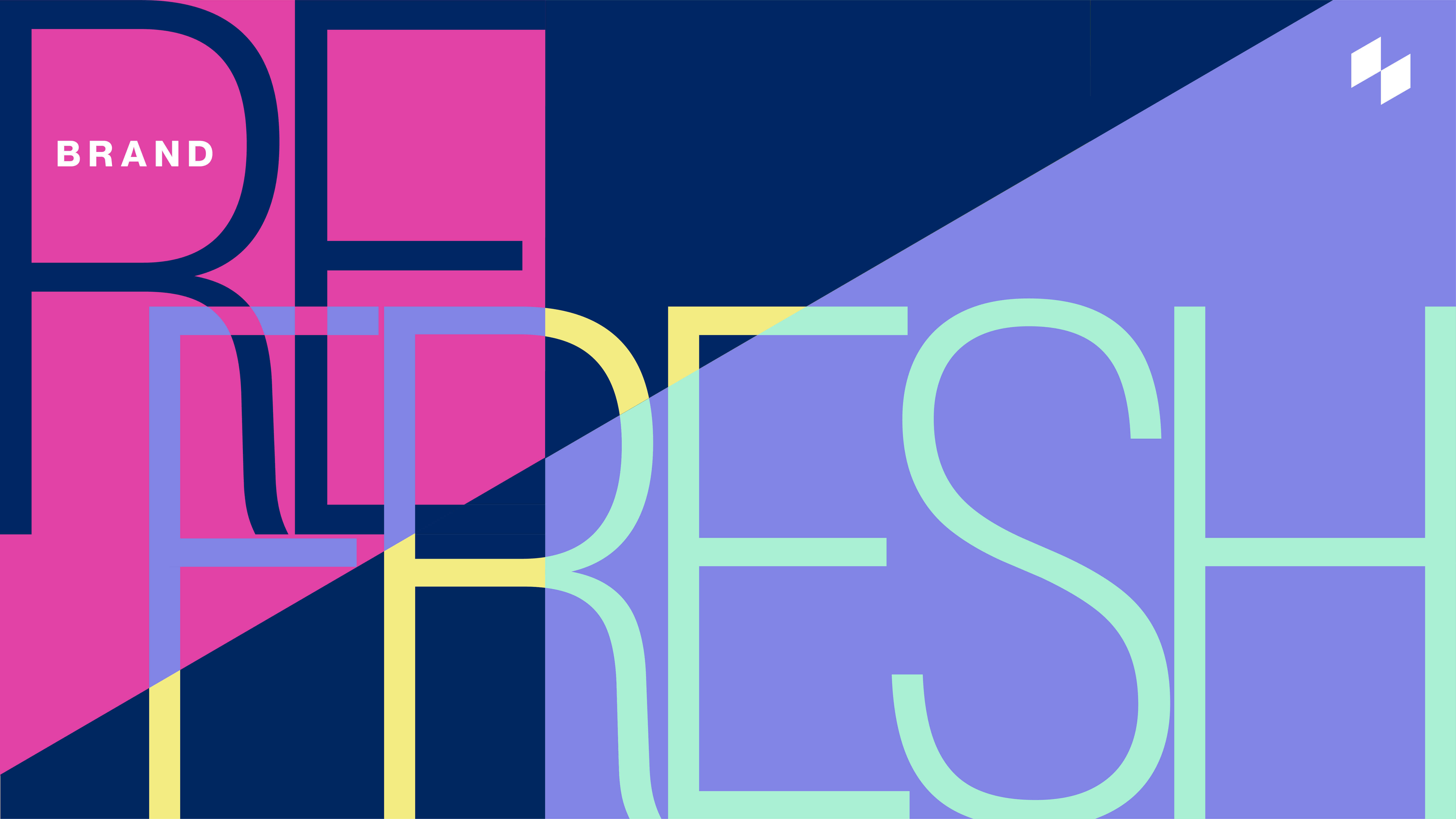
We also updated our brand by incorporating bold, saturated colors into our palette. Flatiron today is vibrant and ever-changing. We embrace color that represents a dazzling array of possibilities. This more vivid gamut allows us to inject a stronger sense of dynamism into our brand experience.
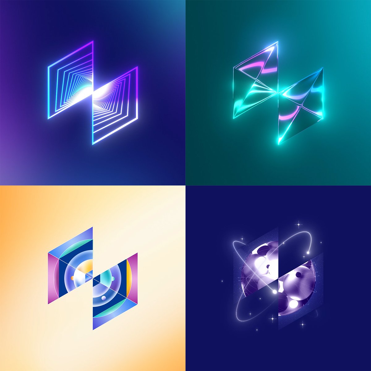 Our system is built on a “prismatic grid” that reinforces the upward angle and intersection point in our logo. And in one of our most significant transitions, we’ve moved from the sometimes austere minimalism that served as backdrops to our previous designs to embrace its antithesis: movement and boldness. It’s a genuine reflection of our ambitions—still carefully chosen, precise, and focused, but now more expansive and complex.
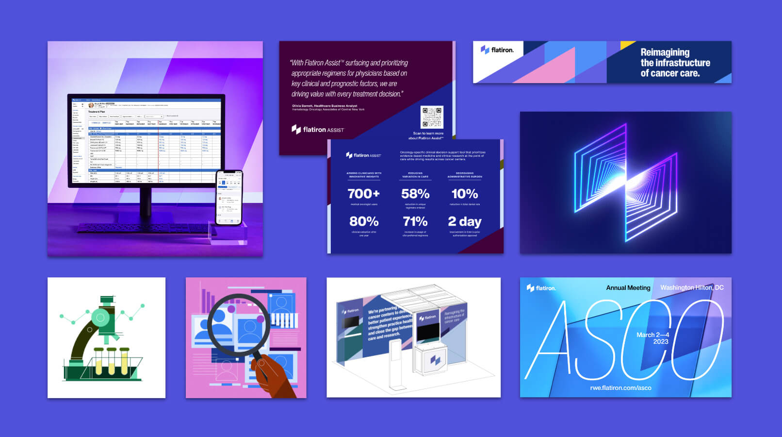
A refreshed brand identity will allow us to present to the world more of what makes us unique as a company. As pioneers and partners in community oncology support and real-world evidence, we see what's next as an exciting challenge, and our brand identity as indicative of our intention to bring the same vigor and passion to new frontiers.
This undertaking is an example of what I’ve always loved most about Flatiron. It’s a product of the collaboration, dedication, creativity, and talent of so many wonderful people in this organization. It’s also a reflection of our growth and an emblem of the promise and possibilities that lie ahead.